UV mapping an image to a plane as modelling reference
By · on December 11, 2009 · CommentsIn a previous post I have described how you can use a reference image as a viewport background in the 3d view and scale it correctly.
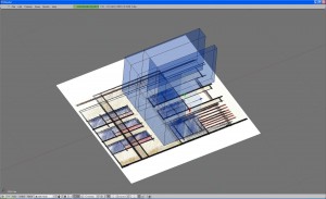
Today I wanted to try a different approach and get my image reference in by mapping it to a plane and turning textured view on in my viewport. This is something I have often used when working in other 3d software and has some advantages, as I can easily position and scale my plane. In modelling for architecture this can be used to bring as reference into Blender cad floor plans, sketches or photographs and easily place them where you need them.
This is what I wanted to get:
Twirly sphere modelling
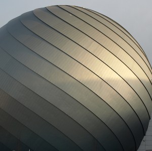
By · on December 5, 2009 · CommentsThere’s a new mall in town and it came with a big swirly-sphere-something that inspired and challenged my Blender budding modelling skills. It’s a spherical structure completely clad in metal sheet, in a spiraled pattern and with an overlapping detail, as you can see in this photograph:
This is not exactly the usual modelling stuff I encounter in my architectural 3d work. Usually it’s straight walls, not anything fun like aliens and robots – so let’s at least try a nice twirly sphere. Read More→
Inkscape shapes imported to Blender
By · on December 1, 2009 · CommentsA new improved version of Inkscape has been recently released. Inkscape is an excellent open source vector illustrating software and I wanted to see if it can be used to symplify work on the graphic details some architectural projects require. For those accustomed to vector illustration applications this might be an easier way to draw an intricate shape than editing it directly in Blender. It is for me as I’m not so good with curves in Blender yet (but working on it!)
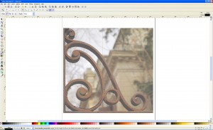
My example is a small cast iron flourish from an old iron gate. I prepared my photograph in Gimp first, correcting the perspective a bit so I could draw directly over it, imported it in Inkscape and quickly sketched the detail using the Bezier curves tool. The svg. format Inkscape uses is then perfectly imported in Blender as curves. I then converted the curves to mesh and extruded them, it worked really nice.
Read More→
Using background reference images correctly scaled
By · on · CommentsThis is a Blender 2.49 post. Related Blender 2.59 article: Using CAD files as correctly scaled raster image reference
………………………………………………………………….
One important aspect of architectural modelling is getting the right dimensions of a project. Working with a set of blueprints and following the dimensions on paper is one way to do it but it is much more efficient to import some form of reference into Blender. My first choice would have been importing 2d line drawings from my Cad application and try to snap my model to these. I am still working on this option and I will write about it when I’ve reached a satisfying conclusion.
In the meantime I was looking at this really nice tutorial on making a house model in Blender and the method used there is to insert a background image of the house plan, work the model over this as reference and in the end scale the model to fit the real units. The use of an image background seemed OK to me: I tried it and the image visibility and that of the objects is very good but I was not pleased about the lack of precision. You can read more about my precision mania here.
So here is my method of getting your raster background image exactly to scale.
Read More→
The new Blender – first look
By · on November 26, 2009 · CommentsI opened the test release for the new Blender 2.5 and it really looks impressive! The design of the interface is new and nice, looks a bit like the rounded theme in the actual version only is much more polished and should be more appealing to new users. I already noticed some of the interface details intended to make it more user friendly than former versions, but even so the classic Blender feel is still there and old users should get around ok as the interface system is still the same. Good work! They will probably allow users who prefer it to choose the old Blender look. Actually I am not sure Blender will be so different and more “easy to learn” with the new face but the more proffesional design will certainly be an incentive for those wondering if it’s worth the effort. Especially architects who are extremely sensitive to design issues 🙂 Read More→


