The new Blender – first look
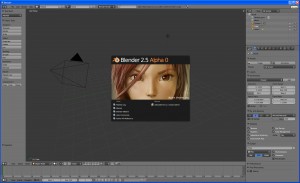
ByI opened the test release for the new Blender 2.5 and it really looks impressive! The design of the interface is new and nice, looks a bit like the rounded theme in the actual version only is much more polished and should be more appealing to new users. I already noticed some of the interface details intended to make it more user friendly than former versions, but even so the classic Blender feel is still there and old users should get around ok as the interface system is still the same. Good work! They will probably allow users who prefer it to choose the old Blender look. Actually I am not sure Blender will be so different and more “easy to learn” with the new face but the more proffesional design will certainly be an incentive for those wondering if it’s worth the effort. Especially architects who are extremely sensitive to design issues 🙂
Some random quick first impressions: noticed the materials preview working much better, several of the “hidden” functions now in sight as buttons and menu items, a shorter render time, an interesting “pin” button in the buttons view, a cool transition effect when changing views.
I’d better say it again, this is a test version and it might have bugs, so for production purposes stick to Blender 2.49 for a while!
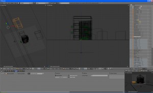
This is how my layout looks in 2.5:
-
Lucidus
-
Oana


