Cut-out people in a Blender archviz scene
ByWhether your scene could use them for a bit of extra detail and realism or just because the client requested it – you have to be prepared to insert them: the happy, carefree cutout people 🙂 (yes, they are usually smiling)
People can be added to the images in two ways, the easiest and most popular way seems to be in post processing (PS, Gimp), but there are advantages as well to inserting them in the Blender model as planes with transparency.
What would be the pros and cons of adding cutouts as planes in Blender? There is an obvious need to do that for animations. In still images, using planes makes scaling the people to real size easy, while in post editing you can make a muddle if you are in a hurry. You can get shadows and reflections without the pain of making them up in Gimp. Of course, if the orientations are wrong you can also get bad give-away shadows and reflections of your 2d-tricky-person. One thing I appreciate is the shortening of the work flow. Having to change something like the angle or render size after you have already prepared your 10-15 people layers means you’ll also lose some time fixing this against the change, while planes in the model will not require fixing – maybe just moving them around a bit. You can also get them to pop out from behind other objects versus making masks in post processing. There is one thing post processing is better at: blending the people in with the scene and applying filters if needed. But still, the tenacious Blender user can use render layers and Compositor to this purpose.
There is also the odd case in which the client does not like the blond girl in the foreground and asks you to remove her right before deadline. Having her on a layer in Gimp solves this faster.
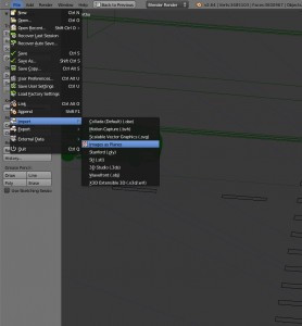
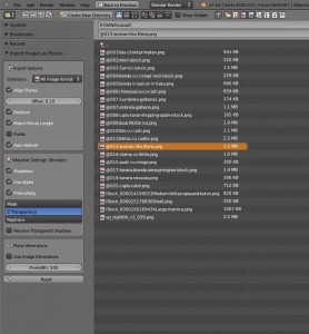
Inserting people as planes is a breeze since Blender got the wonderful “images as planes” addon. First you have to make sure the images you use do have an alpha channel. Then you can adjust the settings in the import window panel or later in the material and texture panels.
Some variations on the settings are possible, for instance I use shadeless and a bit of emit on the material texture when I want the cutouts to look brighter (and happier 🙂 ). One important setting not to be missed is “premultiply” in the texture->image tab, not having it checked results in some bad white edges around the alpha areas.
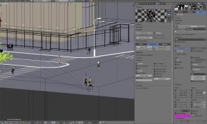
The scene in the image above:
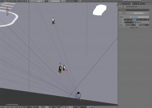
One last neat trick is to link your cutouts to the camera, so they automatically face it (concealing the billboard trick) and keep facing it when you move the camera around:
It kind of looks like kites! Then you have to creatively solve the issue of using several cameras and reattaching all “kites” to the new point of view without too much trouble. In this one I had just one camera and several positions marked with empties, then I moved the camera between them, snapping with Shift+S options. Maybe there’s a better way, like renaming cameras, or setting up a different layer of cutout people for each camera?
Later edit: best fix found for reattaching cutouts to a different camera: I attached them to an Empty object, then I can snap the Empty to the position of any of the cameras. This way I can also make a library file with cutouts ready scaled and linked to an Empty and append them to my scene, ready to use.
Hope this has been useful, happy blending everyone!
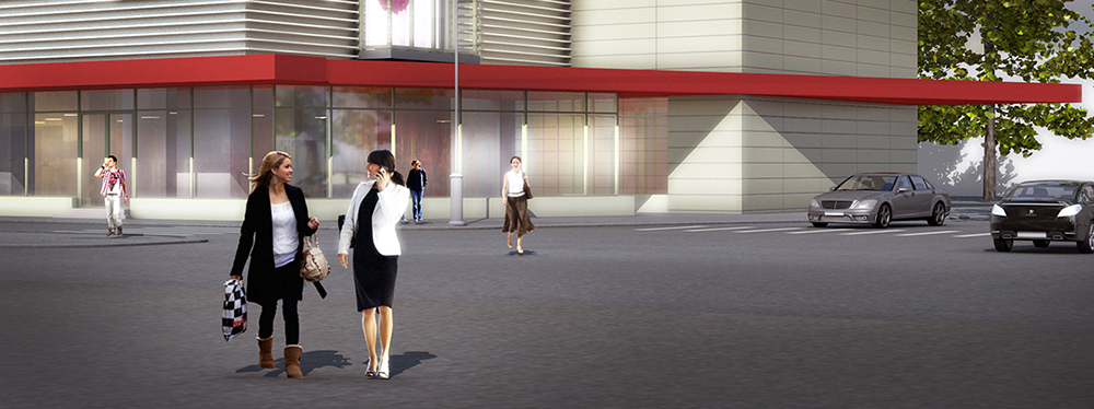
Note: the featured image is a BI render with some post editing (hence the exagerated glow)
-
Maria Beavers
-
Warcos
-
rudl
-
Oana
-
Ricardo Pereira
-
Oana
-
RudyD
-
RudyD
-
CGIFurniture
