Currently blending – RenderStreet graphics
ByThese days I am getting outside my usual line of work with some renders that are on the graphical side of 3d art. As I have written before, I am involved with RenderStreet: a growing online render farm developed by a team of close friends (..and family). Now I am going to produce some new graphics for the website as there has been a lot of work involved in building this but the graphics part was a bit left behind. One thing we agreed upon is that any graphical work, including the logo, will be entirely rendered in Blender. This way all visitors to the site could immediately feel at home! The project is called RenderStreet and I am an architect, so a little architectural imagery is bound to pop up (though I have a secret page layout in preparation that will escape the archviz curse and bring a little more fun. I’ll make that the topic of a future post).
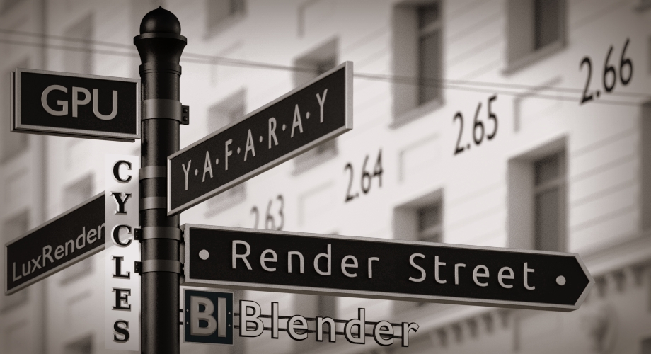
For today though, I have been preparing a banner type image to use for presentation on other sites, and the task was to cram some practical written information inside a neat 3d image. I decided to go ahead with the street sign idea from the Logo (that’s also mine) and started to look around for some inspiration. I soon found an image I really loved and this look suited my project to perfection.
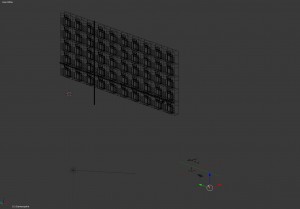
Next I had to decide how to compose my image and get everything inside. One thought was to get a blurred photograph for the building and use the compositor, but I didn’t have a suitable image and I also thought I would get better results if I model the background and make the image all in one piece. This way there is problem of matching perspectives, I could adjust the composition of the building as I pleased, and I could use the camera depth of field in Cycles, something I longed to do! As the building was to be blurred, it didn’t need a lot of correct detail, just a nice array of one window with some detailing around it. You can see I was having fun with this if you look closely in the sharp version, lower right corner!
The scene is this, all in one piece, ready to press render:
The street signs are the little black thing closer to the camera.
I wasn’t sure where to put the version numbers and decided to place them on the building – like they were painted there or something – only they got blurred with the rest of it and didn’t read well anymore. If I blurred less – my special look was gone. So I placed them floating in the air closer to the camera at a point where they get blurred a bit but not so much. This could have been done better I’m sure but I think works well for this one.
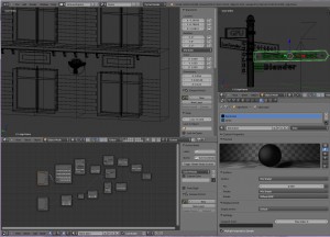
I still have to work a lot on my Cycles materials. I mixed macaroni of glossy and diffuse shaders with image textures and noise textures in a “OK.. now let’s try this” fashion, but can’t do decent bump mapping or speculars yet and I feel the image looses realism this way. But I got the contrast and feel I wanted and I’m happy for now. I added some wires in the out of focus area to… distract from the materials… sigh. The light comes from an environmental texture, a sun lamp and an emitting mesh you can’t see in the image but adds a highlight on the building. I also edited the render outside Blender a bit and was tempted to add film grain – only who is crazy enough to add grain over a perfectly clear Cycles render?!
The banner is now on Blender Network and I think it suits their page design too. OK, I’m also advertising RenderStreet, our pet project, but I hope you enjoyed the post nevertheless and found some inspiration here. I would love to get your feedback on this 🙂
Have a nice blending day!
-
Maria
-
William
-
Thomas
-
Oana


