Compositing a Graphic look
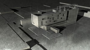
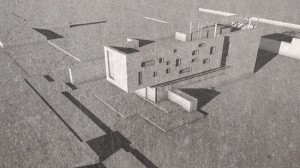
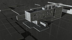
ByInspired by some cool tutorials on postporcessing archviz illustration styles, I tried my hand at using Blender’s Compositor for creating this type of image. The original tutorial used Sketchup+Photoshop and this I think would be easy to recreate with Blender+ps or Gimp, but I took the challenge to mix it all in the Compositor.
After several attempts I used just three render layers:
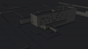
1. a base layer, with the whole scene except the guides, layer material set on a darkish clay. On this layer I checked the shadow pass and excluded it from composite, so I could have a completely separate shadow image to work.
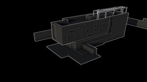
2. a layer with just the building, layer material set darkish clay too.
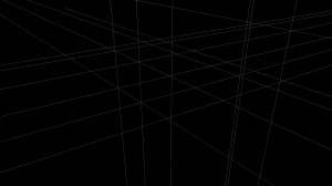
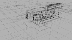
3. a layer for the guides. These were 3d lines I made in the model from an object with two vertices joined by an edge. I set it to a wire material, white and shadeless, so it renders as white lines. I tried to mask this layer with the house layer but didn’t somehow work so I just left all lines to show through.
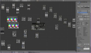
This is a screenshot of the Compositor macaroni and the render layers in render panel:
I also tried to use a layer with some transparency applied to the building (to imitate the x-ray output from sketchup) but that didn’t look well so I left it out. In the end, not willing to let that go, I decided to take a screenshot of the wireframe 3d window and I blended it just a little for some extra texture.
To get edges rendered just on the building, I checked the Edges in Render-> Postprocessing panel and then I disabled Edge in the first and third layer, leaving it only on the second one with the building. I also disabled Sky on all layers, seems to work better like this.
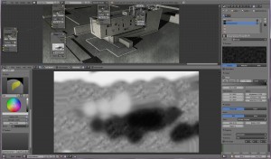
I chose two grungy textures from CGtextures to apply over it all and made a shadowy smudgy one right in Blender’s Image editor:
This is the first time I try this, worked nice, except I’m not great with the Blender brushes, but my painted smudges were updating instantly in the composited image which was really interesting.
I also made a simple mask to fade the guides towards the edge of the image.
One more thing I tried was to make a bit of glow on the layer with the white edges but it doesen’t show much.
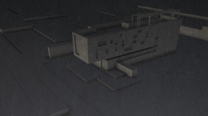
Some other “looks” I got while knitting in the Compositor, I love them all:
Hope you enjoyed this out of the beaten path Blender render 🙂
-
Maria Beavers
-
Carrozza
-
Oana
-
Rovy
-
Lawrence D’Oliveiro
-
Oana
-
norvman
