Blender 2.49 start-up: the interface
ByI’m trying to make this as concise as possible. You can also consult the official user manual for other details.
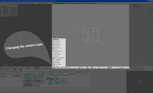
Blender has a really flexible and simple interface. You can have your screen divided any way you like, in adjacent, adjustable windows that you arrange as you wish. Think about the way other software are usually set up: you have the work area with a menu at the top, some floating toolboxes, dockable buttons, rulers, the 3d viewports, in a predefined scheme you can alter to some degree. In Blender you don’t have this sort of differentiations – the screen is divided into any number of identical windows and every one of them can play any part. A Blender window has a header that can be placed at the top or at the bottom. To the left of the header you have a drop down list with all the roles a window can play. As Blender has many functions and modules (meaning it can do a lot of stuff) you have 16 different window types. When you select a different type of window (for 3d view, animation, image editing, etc) the appearance of the window changes and you get other menus or buttons on the header, some window types have floating toolboxes, buttons you can zoom and pan etc.
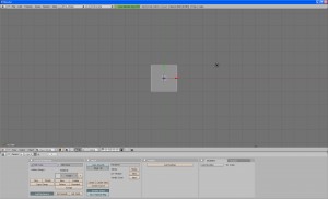
The standard screen set-up – the one you see when you first install Blender – is made of three windows. At the top you see something that resembles the typical menu bar from other programs, but if you notice it’s shape and the drop-down list on the left you will realise it is in fact the header of a hidden window: the User preferences window (see also here). If you pull it down you can see it’s another Blender window. The central part of the screen is occupied by a 3d view window and at the bottom the third window has a top header and is set as a “Buttons Window”, a complex combination of toolboxes and object properties that deserves to be the topic of a separate “start-up” post.
Standard screen:
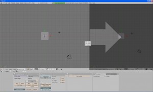
Then you can split or join windows as you like by MMB clicking on the window borders (the mouse cursor changes to a double arrow):
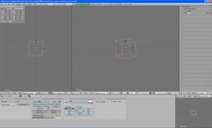
This is the layout I use:
And here I outlined a single window with the drop-down list of Blender window types:
As you can see, I like a list of objects in a narrow window on the right for selection purposes and two 3d view windows. It’s not too crowded as you can go fullscreen with the active window by using the keyboard shortcut Ctrl + up/down arrows.
Just moving the mouse cursor over one window makes it the active one, you don’t have to click on it.
You can also have several screen layouts saved and access them from a drop list in the menu bar. You can check out the standard presets.
There are two other windows that open separately from the main Blender screen: the “console” – something small and black you don’t need to do anything about just keep it minimised and the render window.
And that is the Blender interface in a nutshell.


Pingback: Handling geometry and basic modelling in Blender 2.49 :: Blender Mama()